本文最后更新于:2021年2月7日 凌晨
在 Qt Quick 中有两套与元素布局相关的类库,一套叫作 Item Positioner (定位器),一套叫作 Item Layout (布局)。其实我们前面还讲了一个锚布局,它通过 Item 的 anchors 属性实现,是 Qt Quick 中非常灵活的一种布局方式。
定位器包括 Row(行定位器)、Column(列定位器)、Grid(表格定位器)、Flow(流式定位器)。
布局管理器包括行布局(RowLayout)、列布局(ColumnLayout)、表格布局(GridLayout)。
我们先讲定位器,然生再讲布局管理器。
定位器
定位器是一种容器元素,专门用来管理界面中的其他元素,与传统的 Qt Widgets 中的布局管理器类似。使用定位器,你可以很方便地把众多的元素组织在一起,形成非常规则的界面效果。不过有一点要注意的是,定位器不会改变它管理的元素的大小,即便用户调整了界面尺寸,它也坚持不干涉孩子匀的尺寸。这可能与你的期望不同,也与你使用 Qt Widgets 中的布局管理器的经验不同,不过如果你希望使用“自动根据界面尺寸变化调整孩子们的尺寸”这种竺性,可以使用 Qt Quick 中的布局管理器,它们的行为与你的经验和期望完全一致。
常用的定位器元素有下列几种:
Row
Row 沿着一行安置它的孩子们,在你需要水平放置一系列的 Item 时,它比锚布局更加方便。一旦你把一个 Item 交给 Row 来管理,那就不要在使用 Item 的 x、y、anchors等属性了,Row 会安排得妥妥的。
在一个 Row 内的 Item,可以使用 Positioner 附加属性来获知自己在 Row 中的详细位置信息。Positioner 有 index、isFirstItem、isLastItem 三个属性。
代码
main.qml
1
2
3
4
5
6
7
8
9
10
11
12
13
14
15
16
17
18
19
20
21
22
23
24
25
26
27
28
29
30
31
32
33
34
35
36
37
38
39
40
41
42
43
44
45
46
47
48
49
50
51
52
53
54
55
56
57
| import QtQuick 2.12
import QtQuick.Window 2.12
import QtQuick.Controls 2.12
Window {
width: 640
height: 480
visible: true
title: qsTr("Row 定位器")
Row {
id: colorRow
anchors.left: parent.left
anchors.leftMargin: 4
anchors.bottom: parent.bottom
anchors.bottomMargin: 4
spacing: 4
Rectangle {
width: 60
height: 60
color: "red"
}
Rectangle {
width: 60
height: 60
color: "green"
}
Rectangle {
width: 60
height: 60
color: "blue"
}
Rectangle {
width: 60
height: 60
color: "yellow"
}
}
Button {
id: toggleDir
text: qsTr("切换方向")
font.bold: true
anchors.bottom: colorRow.top
anchors.bottomMargin: 4
anchors.left: parent.left
anchors.leftMargin: 4
onClicked: {
colorRow.layoutDirection = colorRow.layoutDirection ? Qt.LeftToRight : Qt.RightToLeft
}
}
}
|
演示
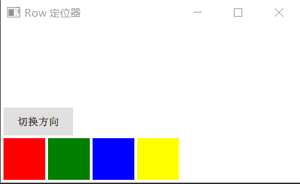
Row 有一个 spacing 属性,用来指定它管理的 Item 之间的间隔。还有一个 layoutDirection 属性,可以指定布局方向,取值为 Qt.LeftToRight 时从左到右放置 Item,这是默认行为,取值为 Qt.RightToLeft 时从右向左放置 Item。
Row 还有 add、move、populate 三个 Transition 类型的属性,分别指定应用于 Item 尜加、Item 移动、定位器初始化创建 Items 三种场景的过度动画,等我们学习了动画相关的内容之后再来实验这些属性。
Colomun
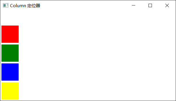
Column 与 Row 类似,不过是在垂直方向上安排它的子 Item。在你需要垂直放置一系列的 Item 时,它比锚布局更加方便。
Column 本身也是一个 Item,可以使用 anchors 布局来决定它在父 Item 中的位置。Column的 spacing 属性描述子 Item 之间的间隔。
代码
main.qml
1
2
3
4
5
6
7
8
9
10
11
12
13
14
15
16
17
18
19
20
21
22
23
24
25
26
27
28
29
30
31
32
33
34
35
36
37
38
39
40
41
42
43
| import QtQuick 2.12
import QtQuick.Window 2.12
import QtQuick.Controls 2.12
Window {
width: 640
height: 480
visible: true
title: qsTr("Column 定位器")
Column {
id: colorColumn
anchors.left: parent.left
anchors.leftMargin: 4
anchors.bottom: parent.bottom
anchors.bottomMargin: 4
spacing: 6
Rectangle {
width: 60
height: 60
color: "red"
}
Rectangle {
width: 60
height: 60
color: "green"
}
Rectangle {
width: 60
height: 60
color: "blue"
}
Rectangle {
width: 60
height: 60
color: "yellow"
}
}
}
|
Grid
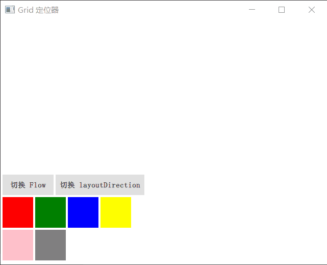
Grid 在一个网格上安置它的子 Item,它会创建一个拥有很多单元格的网格,足够容纳它的所有子 Item。Grid 会从左到右、从上到下把它的子 Item 一个个塞到单元格里。Item 默认会被放在一个单元格左上角,即(0,0)位置。
你可以通过 rows 和 columns 属性设定表格的行、列数。如果不设置,默认只有 4 列,而行数则会根据实际的 Item 数量自动计算。rowSpacing 和 columnSpacing 指定行、列间距,单位是像素。
Grid 的 flow 属性描述表格的流模式,Grid.LeftToRight 是默认值,这种流模式从左到右一个挨一个放置 Item,一行放满再放下一列。
horizontalItemAlignment 和 verticalItemAlignment 指定单元格对齐方式。默认的单元格对齐方式和 layoutDirection 以及 flow 有关。
代码
main.qml
1
2
3
4
5
6
7
8
9
10
11
12
13
14
15
16
17
18
19
20
21
22
23
24
25
26
27
28
29
30
31
32
33
34
35
36
37
38
39
40
41
42
43
44
45
46
47
48
49
50
51
52
53
54
55
56
57
58
59
60
61
62
63
64
65
66
67
68
69
70
71
72
73
74
75
76
77
78
79
80
81
82
83
| import QtQuick 2.12
import QtQuick.Window 2.12
import QtQuick.Controls 2.12
Window {
width: 640
height: 480
visible: true
title: qsTr("Grid 定位器")
Grid {
id: colorGrid
anchors.left: parent.left
anchors.leftMargin: 4
anchors.bottom: parent.bottom
anchors.bottomMargin: 4
rows: 3
columns: 4
rowSpacing: 4
columnSpacing: 4
Rectangle {
width: 60
height: 60
color: "red"
}
Rectangle {
width: 60
height: 60
color: "green"
}
Rectangle {
width: 60
height: 60
color: "blue"
}
Rectangle {
width: 60
height: 60
color: "yellow"
}
Rectangle {
width: 60
height: 60
color: "pink"
}
Rectangle {
width: 60
height: 60
color: "gray"
}
}
Button {
id: flowBtn
anchors.left: parent.left
anchors.leftMargin: 4
anchors.bottom: colorGrid.top
anchors.bottomMargin: 4
text: "切换 Flow"
font.bold: true
onClicked: {
colorGrid.flow = colorGrid.flow ? Grid.LeftToRight : Grid.TopToBottom
}
}
Button {
anchors.left: flowBtn.right
anchors.leftMargin: 4
anchors.bottom: colorGrid.top
anchors.bottomMargin: 4
text: "切换 layoutDirection"
font.bold: true
onClicked: {
colorGrid.layoutDirection = colorGrid.layoutDirection ? Qt.LeftToRight : Qt.RightToLeft
}
}
}
|
演示
Flow
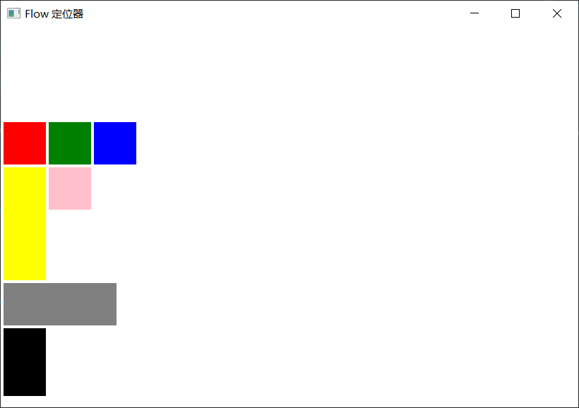
Flow 其实和 Grid 类似,不同之处是它没有显式的行、列数,它会计算子 item 的尺寸,然后与自身尺寸比较,按需折行。Flow 的 flow 属性,默认取值 Flow.LeftToRight,从左到右安排 Item,直到 Flow 本身的宽度不能容纳新的子 Item 时折行;当 flow 取值 Flow.TopToBottom时,从上到下安排 Item,直到 Flow 本身的高度不能容纳新的子 Item 时开始在下一列安排 Item。
Flow 的 spacing 属性描述 Item 之间的间隔。与 Row 等定位器元素一样,Flow 也有 add、move、populate 三个与动画相关的属性。
代码
main.qml
1
2
3
4
5
6
7
8
9
10
11
12
13
14
15
16
17
18
19
20
21
22
23
24
25
26
27
28
29
30
31
32
33
34
35
36
37
38
39
40
41
42
43
44
45
46
47
48
49
50
51
52
53
54
55
56
57
58
| import QtQuick 2.12
import QtQuick.Window 2.12
Window {
width: 640
height: 480
visible: true
title: qsTr("Flow 定位器")
Rectangle {
anchors.fill: parent
Flow {
anchors.left: parent.left
anchors.leftMargin: 4
anchors.bottom: parent.bottom
anchors.bottomMargin: 4
width: 200
height: 400
spacing: 4
Rectangle {
width: 60
height: 60
color: "red"
}
Rectangle {
width: 60
height: 60
color: "green"
}
Rectangle {
width: 60
height: 60
color: "blue"
}
Rectangle {
width: 60
height: 160
color: "yellow"
}
Rectangle {
width: 60
height: 60
color: "pink"
}
Rectangle {
width: 160
height: 60
color: "gray"
}
Rectangle {
width: 60
height: 96
color: "black"
}
}
}
}
|
布局管理器
Qt Quick 中的布局管理器与 Qt Widgets 中的相似,它与定位器的不同之处在于:布局管理器会自动调整子 Item 的尺寸来适应界面大小的变化。
要使用布局管理器,需要引入 Layouts 模块,这样:
| import QtQuick.Layouts 1.1
|
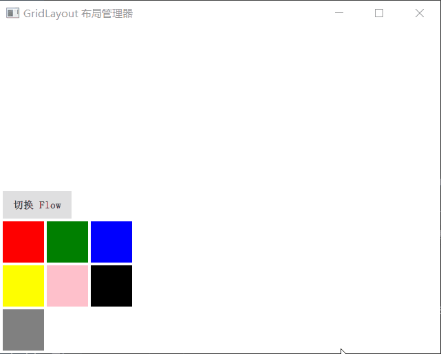
GridLayout
GridLayout 与 Qt C++ 中的 QGridLayout 功能类似,它在一个表格中安排它管理的 Item,如果用户调整界面尺寸,GridLayout 会自动重新调整 Item 的位置。
GridLayout 会根据 flow 属性来排列元素,这与 Grid 定位器类似,flow 属性的默认值是 GridLayout.LeftToRight,从左到右安排元素,一行结束再另起一行。而判定行结束的一条件是 columns 属性,它指定一个 GridLayout 的列数。如果 flow 取值 GridLayout.TopToBottom,GridLaout 则从上到下安排元素,一列结束再另起一列。rows 属性指定 GridLayout 的行数,它阄决定何时新开一列来排布剩余的元素。
代码1
main.qml
1
2
3
4
5
6
7
8
9
10
11
12
13
14
15
16
17
18
19
20
21
22
23
24
25
26
27
28
29
30
31
32
33
34
35
36
37
38
39
40
41
42
43
44
45
46
47
48
49
50
51
52
53
54
55
56
57
58
59
60
61
62
63
64
65
66
67
68
69
70
71
| import QtQuick 2.12
import QtQuick.Window 2.12
import QtQuick.Layouts 1.12
import QtQuick.Controls 2.12
Window {
width: 640
height: 480
visible: true
title: qsTr("GridLayout 布局管理器")
GridLayout {
id: colorGridLayout
anchors.left: parent.left
anchors.leftMargin: 4
anchors.bottom: parent.bottom
anchors.bottomMargin: 4
rows: 3
columns: 3
rowSpacing: 4
columnSpacing: 4
Rectangle {
width: 60
height: 60
color: "red"
}
Rectangle {
width: 60
height: 60
color: "green"
}
Rectangle {
width: 60
height: 60
color: "blue"
}
Rectangle {
width: 60
height: 60
color: "yellow"
}
Rectangle {
width: 60
height: 60
color: "pink"
}
Rectangle {
width: 60
height: 60
color: "black"
}
Rectangle {
width: 60
height: 60
color: "gray"
}
}
Button {
anchors.left: parent.left
anchors.leftMargin: 4
anchors.bottom: colorGridLayout.top
anchors.bottomMargin: 4
text: "切换 Flow"
font.bold: true
onClicked: {
colorGridLayout.flow = colorGridLayout.flow ? GridLayout.LeftToRight : GridLayout.TopToBottom
}
}
}
|
演示1
GridLayout 所管理的 Item,可以使用下列附加属性(这正是布局管理器和定位器之关键不同点):
- Layout.row
- Layout.column
- Layout.rowSpan
- Layout.columnSpan
- Layout.minimumWidth
- Layout.minimumHeight
- Layout.preferredWidth
- Layout.preferredHeight
- Layout.maximumWidth
- Layout.maximumHeight
- Layout.fillWidth
- Layout.fillHeight
- Layout.alignment
RowLayout
RowLayout 管理的元素可以使用以下附加属性:
- Layout.minimumWidth
- Layout.minimumHeight
- Layout.preferredWidth
- Layout.preferredHeight
- Layout.maximumWidth
- Layout.maximumHeight
- Layout.fillWidth
- Layout.fillHeight
- Layout.alignment
ColumnLayout
ColumnLayout 管理的元素可以使用以下附加属性:
- Layout.minimumWidth
- Layout.minimumHeight
- Layout.preferredWidth
- Layout.preferredHeight
- Layout.maximumWidth
- Layout.maximumHeight
- Layout.fillWidth
- Layout.fillHeight
- Layout.alignment